I’ve been using Bakhtin’s theory of dialogism for the past decade, first in studying and writing the novel, and then in studying and making film. Although Bakhtin’s work began in theorising the visual arts, his mature work focusses on literature (Bakhtin, 1984). As film is to a large extent a predominantly narrative form, dialogism can be transferred with only a small amount of adaptation. Using his theories to research visual art, however, can present obstacles where the work is not explicitly narrative in nature. Works do exist (e.g. Haynes, 2009), and I will make use of these in due course.
What appeals to me about Bakhtin is that he locates the artist as embedded socially, influenced by and in turn influencing the discourses, particularly those carried in language, in which they are immersed. Specifically, Bakhtin grants the artist, and indeed all people, agency in evaluating, responding to and articulating discourse; he considers this the fundamental activity in the creation of identity. This agency permits a more fluid, complex and subtle application of ways in which discourse constitutes socially and has been influential in shaping periods of post-colonial and feminist thought. However, while both lexical and symbolic language is constituted through photography, as articulated thoroughly through theoretical focus on semiotics, I am presently more interested in how aesthetic style is socially embedded rather than simply individualistic. By this, I mean not simply the historic artistic pedigree of style, but how style engages with and is shaped by society in a wider sense.
I was thus enthused to come across the work of Ranciere in the context of photography. Ranciere’s theories of artistic regimes – distinct but overlapping historical movements that shape but create problems for artists – connects aesthetics to politics, philosophy and community (Deranty, 2010). Like Bakhtin, Ranciere argues that the artist struggles with the influences of their regimes, especially where different elements appear contradictory, and their art is an attempt at reconciliation. He also refutes different artistic media as discrete and hermetic worlds but sees them as different iterations of and responses to these regimes, something that chimes with my own outlook having practiced in several different art forms and my wish to combine these in my work. Ranciere’s theorising of montage is also going to be relevant here and worthy of further study.
Ranciere argues that, in the wake of the c.18threvolutions and Romanticism, which he links, the present regime is that of the aesthetic, whereby the expressivity of language in its own right becomes the dominant focus of artistic activity, rather than as simply a vehicle for representation. It’s important to note that Ranciere does not argue in absolute binary terms, and that different regimes co-exist and cross-fertilise; the representative regime is still a major influence on art made up to the present. This way of understanding my own practice begins to answer my problems with the gaze, which appears to me to be too ideologically limited a definition of the practice of photography.
Like Bakhtin’s identification of polyphony in the novels of Dostoevsky, Ranciere argues that the aesthetic regime makes possible a radical equality of voices whereby no subject matter or means of expression is invalid in the creation of art, and he traces c.20thexpressions of this such as pop art and postmodernism back to Romanticism. Of particular interest to my practice is Ranciere’s identification of the aesthetic regime as making possible direct artistic ‘expressivity’ of the world’s raw material, rather than or in addition to, as with the representational regime, the world as a symbol. I’m very much interested in expressing palpable, experienced presence through my photography – and film – while being mindful of symbolic meaning. This is a very good starting point for me to begin to reconcile these seemingly paradoxical elements; indeed, Ranciere specifically considers, critiques and develops Barthes’ model of the punctum and stadium (1993) which articulates a related binary in a quite distinct way.
Having only recently read Ranciere, I am still digesting it. However, I will report back at a later date how this is becoming relevant to my practice.
Bakhtin, M. M. 1984. Problems of Dostoevsky’s Poetics. Minneapolis: University of Minnesota Press.
Barthes, R. Camera Lucida. 1993. London: Vintage Classics.
Deranty, J. (ed.) 2010. Jacques Ranciere: Key Concepts. London: Routlege.
Haynes, D. J. 2009. Bakhtin and the Visual Arts. Cambridge: Cambridge University Press.
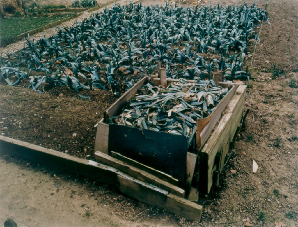
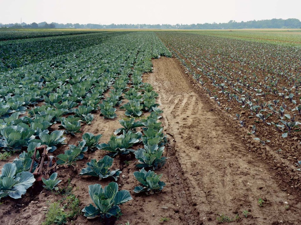
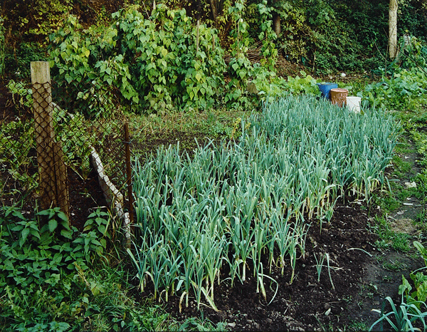
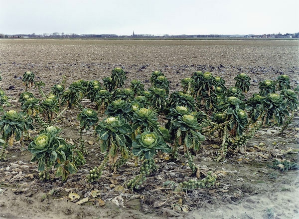
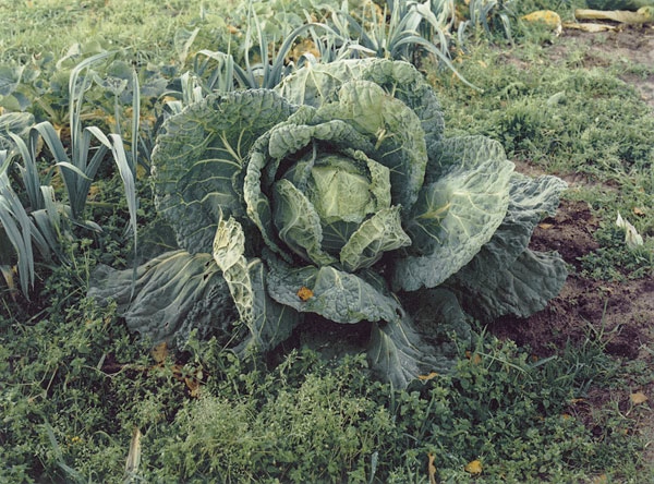
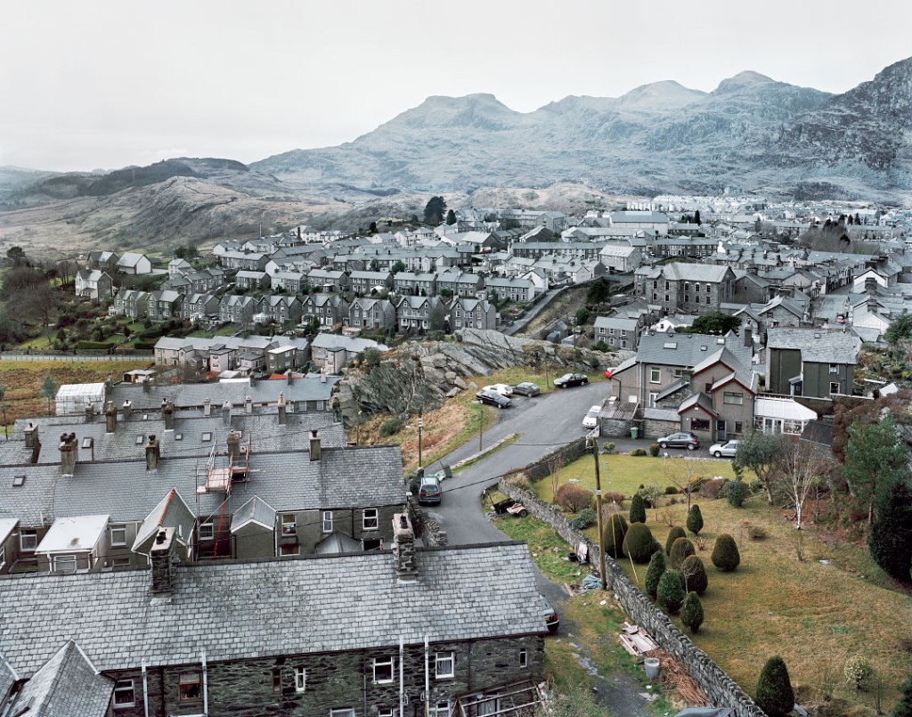
Simone Nieweg is a photographer I can really learn from. This collection, shot between 1987 and 2001, explores very specific German agricultural landscapes. That she’s a Becher student is evident in her patient recording of typologies under typically Becher-ish overcast lighting conditions. The collection, like those of the Bechers, becomes hypnotic through repetition. Endlessly unremarkable vegetable plots. Squashed horizons. Cabbages and sprouts and leeks. As with the Bechers, after a while, the repetition begins to abstract its subject, and the plots becomes geometric patterns of texture and colours – and under the light and the palette Nieweg uses, the distinctions between textures and colours is very subtle, drawing you in to look harder.
It’s an exquisitely beautiful experience, strangely reminiscent of Rothko. Nieweg has a fascination with line that I share with her, and she knows how to draw it out and assemble it from both organic and non-organic elements. Lines move this way and that, there are sharp corners and though there is often so little to look at, the eye is drawn through and around the scene no less compellingly than if this were a Hokusai.
And yet, for all this abstraction, this is neither a-political, nor does it efface photography’s documentary facility. Human intrusion into the vegetable world is shown as abrupt and all-present, as if the yellow grass and battered brassica have been beaten into submission. The industrial scale of agriculture is laid bare, squashing human habitation into distant horizons, the emptiness of most scenes suggesting people have invaded, wreaked their violence on the soil, and then retreated from the battlefield of churned up mud. This is the countryside, but it’s a man-made countryside, anything growing, doing so permissively, submissively.
That the book is so beautiful, punctuated occasionally and ecstatically with sunlight on fences or a truly glorious swede, prevents the message from being overbearing or didactic, but it’s unavoidable. It’s almost too rich to consume in one sitting.
I have found a key influence here. I need to understand the geometries available to me through heathland paths, birch scrub, log piles, pool reflections and pine copses, and how these can be harnessed with human artefacts to develop the commons beyond being simply attractive. This will let me politicise my aesthetics.
Mutters Moor, 2020. Andy Thatcher.
Nieweg, Simone. 2002. Landschaften und Gartenstücke. Berlin: Schirmer/ Mosel.
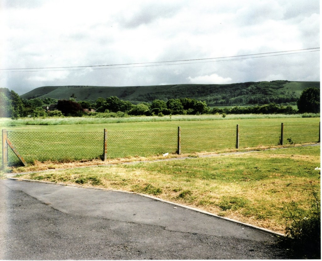
I love it when I come across a photographer who feels like a fellow traveller. Shore. Godwin. Gossage. And now Billingham to add to the list. Why? Billingham, like me, has a fascination with bold lines and bands of texture and colour. Like me, people are within the landscape, if they’re there at all. He also has an eye for extremes – acute angles, brutally partitioned flat horizons. What is especially interesting is that his images largely place natural lines either horizontally (horizons, water) or vertically (trees, cliffs). It’s the manmade lines that are typically diagonal – tracks, wires, fences.
Pond, 2002.Tree Boles. 2002.
What really impresses me, aside from the immersive sequencing of this collection, is how his eye and style applies itself to such a variety of landscapes in such a way that they’re rendered both uniform and distinctive, as with the two pictures below.
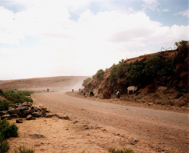
South Downs. 2003. Ethiopian Landscape. 2002.
The collection demonstrates a sameness to landscapes which allows the viewer to consider their distinctiveness by, effectively, placing them side by side. Here, both compositions are similar. But the colours, the sky, the cattle, dust – and lack of it, metalled surface – and lack of it – sharply delineate the economic power which makes a leisure trip to the South Downs, from the lack of it which is evidenced by the subsistence farming of Ethiopia.
I’m still determining my style, as I don’t want to limit the communicative aspect of my practice by narrowing too much. Billingham’s work demonstrates that style and message can form a coherent whole.
Grass Verge, 2001.
Billingham, R. 2008. Landscapes 2001-2003. Stockport: Dewi Lewis Publishing.
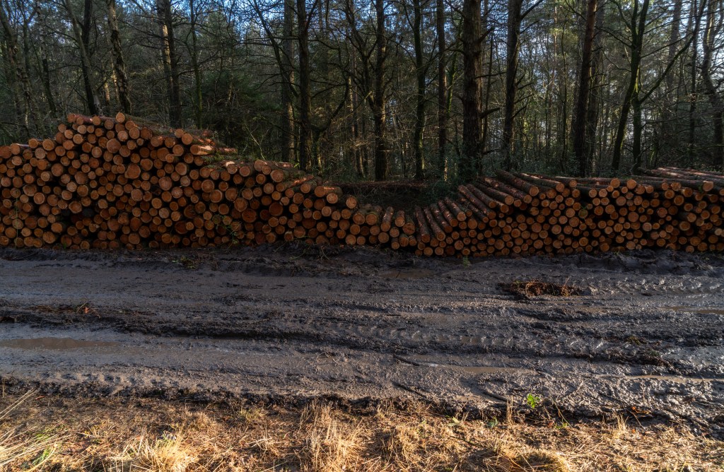
I was out shooting yesterday at Mutters Moor, a sliver of common along an East Devon ridge, when I came across a shiny white Land Rover and a picnic table groaning with thermoses, bottled water and snacks. The table commanded a stunning view, new to me, up the coast towards Exmouth and on to Torbay. It’s a view so stunning, so I was told by the Land Rover’s keeper, it’s even got a name: The Queen’s View. The keeper explained he was awaiting a group of off-roaders in 4X4s off for a corporate day out – his business. After chatting a while, I took in the view and went my way.
This would have been a great photo op. It’s incongruous, political (considering the ongoing battles against off-roaders in the Lake District) and would have been aesthetically interesting. However, as I went my way, it occurred to me I never even thought to include what I’d stumbled across in my walk, in the way I’d included logging an hour or so earlier. This is partly because I’m still very shy of asking to take people’s photos, however much reassurance I might have had from people over the years. But I think there’s something else going on. I think, for what I’m trying to achieve, people are a distraction.
The influential theorist of film sound, Michel Chion, argues that whenever a human voice appears in a soundtrack, it without fail attracts attention to the extent where it instantaneously becomes predominant. I’ve argued previously, also referring to film, that the appearance of people into landscape has an analogous effect, and used this phenomenon in my film, Strands, by allowing the audience time to experience an unpeopled landscape before people enter the frame and after they leave it. This was intended to allow the audience both to ‘dwell’ in the landscape in sensory terms and to experience it as mediated by people connected with it in narrative terms.
The temporally-fixed frame of stills photography does not allow for such flexibility, but neither does it make such flexibility impossible. The work of, for example, Simon Roberts, envisions landscape in a very human, narrative way by including activity, even when taking up a minute portion of the frame; it is about landscape, but it is even more about specific people’s relationship with their landscape, as demonstrated in series titles such as We English. When faced with his work, which I love, my initial response is to wonder who these people are and what they’re doing, before beginning to see their relationship with the rest of the image.
Camel Estuary, Padstow, Cornwall, 27 September 2007. Simon Roberts, 2009.
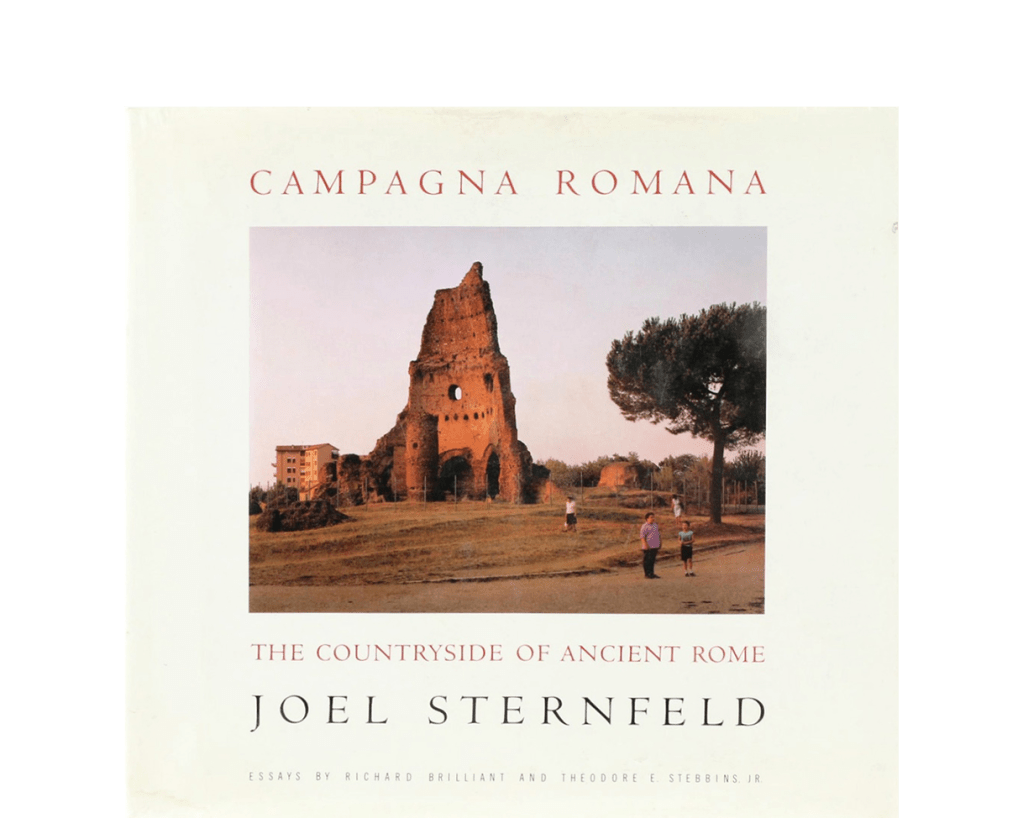
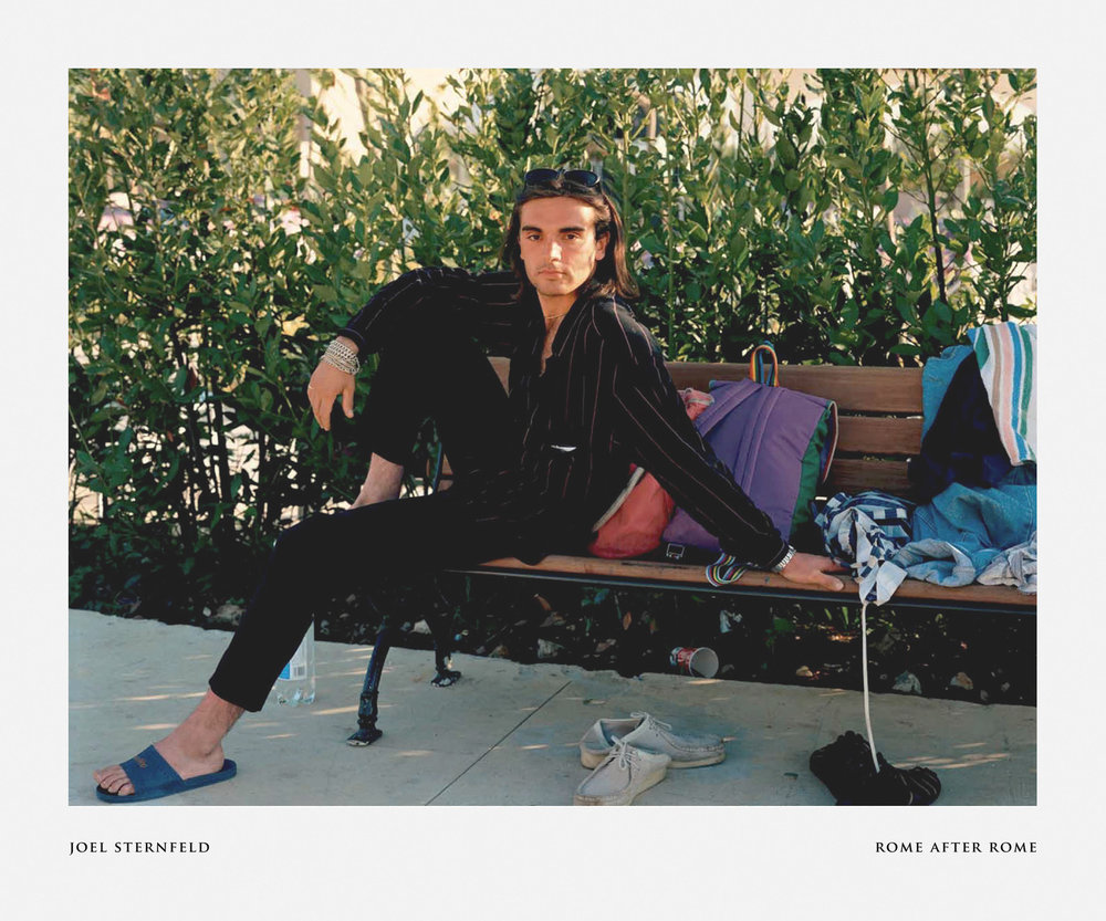
Another strategy is to interlace unpopulated landscape shots with portraits or documentary images. This was Joel Sternfeld’s approach in Campagna Romana, which has scant, slightly surreal but poignant portraits in amongst the shots of the remnants of ancient Rome taken over several years. It’s an exquisite series that allows for a sense of discovery of this extraordinary landscape that extends to a map at the back. Last year’s Rome after Romerevisits and reenvisions this series, richly updating its reproduction but also including far more portraits to the extent where portraits follow one another. The book is, deliberately, much more about the people: the landscape becomes theirs, rather than as previously, they appearing as a part of their landscape. While no less successful as a book, the sense of immersion is gone, and one gets the sense of peering around the portraits to see their landscapes. This difference is demonstrated effectively by their two different front covers.
People are very much a part of my commons project. Commons are given their characteristics by human agency, whether conservation, history, leisure or economic usage, or – especially – legal status. I want to explore these dimensions in my project, and I also want to explore the different sensory ways in which they can be experienced – what it feels like for people to be on a common. I want my project, as with Strands, to be an immersive experience. I want viewers to have a degree of agency, to be able to develop their own connections and explore the landscapes presented for themselves, partly to give them space to reflect on their own experience of commons, and I believe my intentions could be at odds if I included people visually in this project. So, had I included a portrait of the man with his Land Rover, or his assistant at the picnic table, even if relatively small in the frame against the magnificent backdrop of The Queen’s View, the image would become primarily about off-roading, and the meanings to be drawn from it, and about The Queen’s View as a cultural rather than sensory experience. Nothing wrong with that, of course, just not my intention.
It has long been my intention to include writing in my work, and through leaving the visual ‘channel’ unpopulated but populating the textual ‘channel’, I think a balance could be struck: ultimately, it’s the viewers choice how to interrelate text and image and all kinds of interrelationships can be explored through formatting, something I’m investigating presently. But that’s something to discuss on another occasion.
Chion, M. 1999. The Voice in Cinema. NYC: Columbia University Press.
Roberts, S. 2009. We English. London: Chris Boot.
Sternfeld, J. 1992. Campagna Romana.NYC: Alfred A. Knopf.
Sternfeld, J. 2019. Rome After Rome. Göttingen: Steidl.
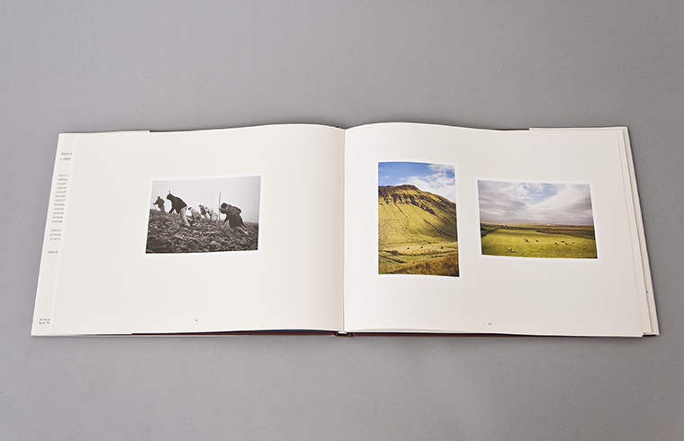
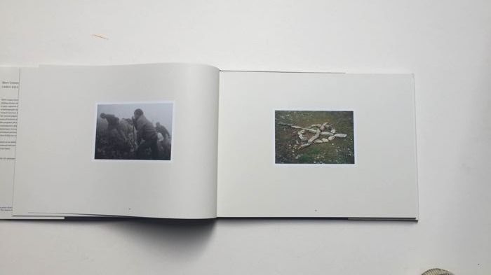
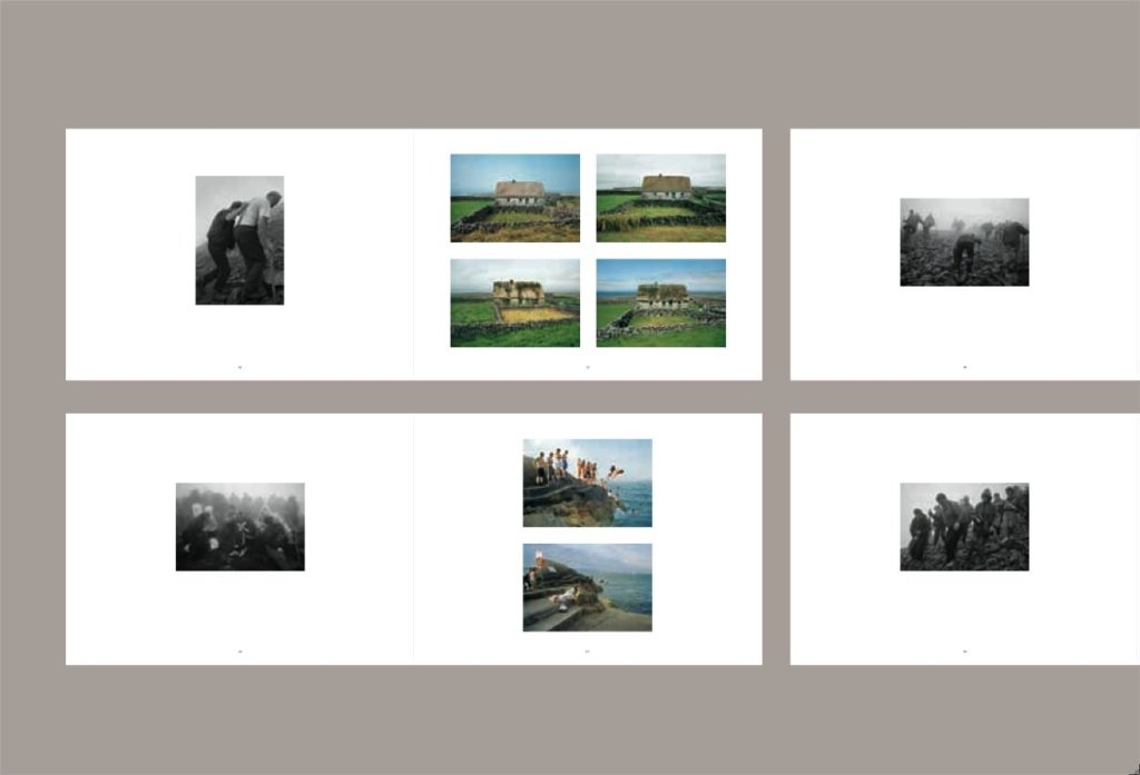
This book is a masterpiece of mood and narrative. Chris Killip is new to me, however celebrated he might be within the world of photography. This selection of photos were taken over a ten year period across Ireland. A third are in black and white, Killip’s style dips into documentary shots of events such as pilgrimage and sea bathing, abstracts, landscapes, domestic details, some are shot from car windows. And yet, and without any accompanying text, they form an emotional and narrative unity. There is much, much for me to learn here, about suggestion, narrative, mood, continuity and discontinuity. One format is continually adhered to: the left hand page is always a single black and white shot of a pilgrimage into the mountains, with the pilgrims almost uniformly dominating the frame, which the right hand page is aways colour, though between one and four images. The effect is of following a single pilgrimage – without accompanying detail, it might just as well be a single pilgrimage though it is in fact two – up and down the mountain. This provides a narrative arc, perhaps the most primordial of all narrative arcs.
The colour shots are brought into dialogue with each shot – sometimes through explicit visual referencing such as a winding road, or thematic, such as a particularly arduous moment of the pilgrimage with a stone hand-constructed cross, suggesting penitence. Sometimes both sides show pilgrimage, providing a paradoxical sense of changing times and continuity.
At other times, the connection isn’t explicit, but so carefully sequenced around other images that one feels as if it must be connected and so forges the connection oneself – an old man paired with a thatched roof decaying implies the inevitability of time passing and thus death, linking the teenagers in black and white and as misbehaving sea-bathers suggests a universality of experience that embraces contradiction and subversion.
Particularly important for me is that, when Killip pairs with semi-abstracts with a botanical or geographical subject, a powerful sensory impression is delivered: the textures of scree suggest the sound and difficulty of walking over it illustrated in black and white, a young adult in prayer paired with a colourful, sunlit tree suggests peacefulnes, pilgrims on steep inclines paired on two double spreads with blocked field entrances suggests difficulty and determination. What I can begin to learn from here – and what I can now begin to transfer as knowledge from editing film – is how photographs can together create meanings that individually they cannot. I am accustomed to thinking of photographs as singular worlds. Killip has shown me that fresh and powerful meanings are possible when thinking of them in combination.
Killip, C. 2009. Here Comes Everybody: Chris Killip’s Irish Photographs. London: Thames & Hudson.
It is a wonderful experience when you find a photographer of enormous skill who seeks out the same things as you. It’s a validation, a challenge, and an education in how much better you could do what you do. This is absolutely the case with Pfahl’s 1982 series Power Places, which I’ve come across in the retrospective A Distanced Land. While Pfhal uses the power plants as the starting point in all his images, each is about what he finds more generally: Pfahl explores a landscape, develops his own relationship to it and his own fascinations and embeds the ‘power places’ within that. Paradoxically, this throws perhaps even more stress on his subject, and through making it smaller it is often somehow more dominant, drawing the attention again and again. This is one major aspect of my M5 Exeter bridge project – although I have also used many images up very close indeed. To demonstrate this, and without in any way suggesting our photography is equal, I’ve included a photo of my own below Pfahl’s – taken long before I’d registered for this Masters course, let alone even hearing of Pfahl.
Pfahl’s image is dominated by the tree. Other photos of other power stations are dominated by mountains, clouds, water, scrub. On a formal level, the framing in exquisite, the tree filling the frame but, so it appears, making room for the power station while blending in with the wooded river bank. The messy late autumn textures and veinlike branches and dull colours are thrown into disorder by the power plant’s geometric shapes, and pale yellow and red. The eye is drawn back to it again and again like an itch that needs scratching.
Pfahl took pains to present the power plants neutrally. He invites the viewer to respond for themselves, and was amused that both anti- and pro-nuclear groups believed him to be on their side. The plants are embedded in the landscape, he seems to be saying. They are part of it. Whether this is a good thing or not is in the personal response. ‘A tension is created’, he said, ‘that cries out for resolution.’
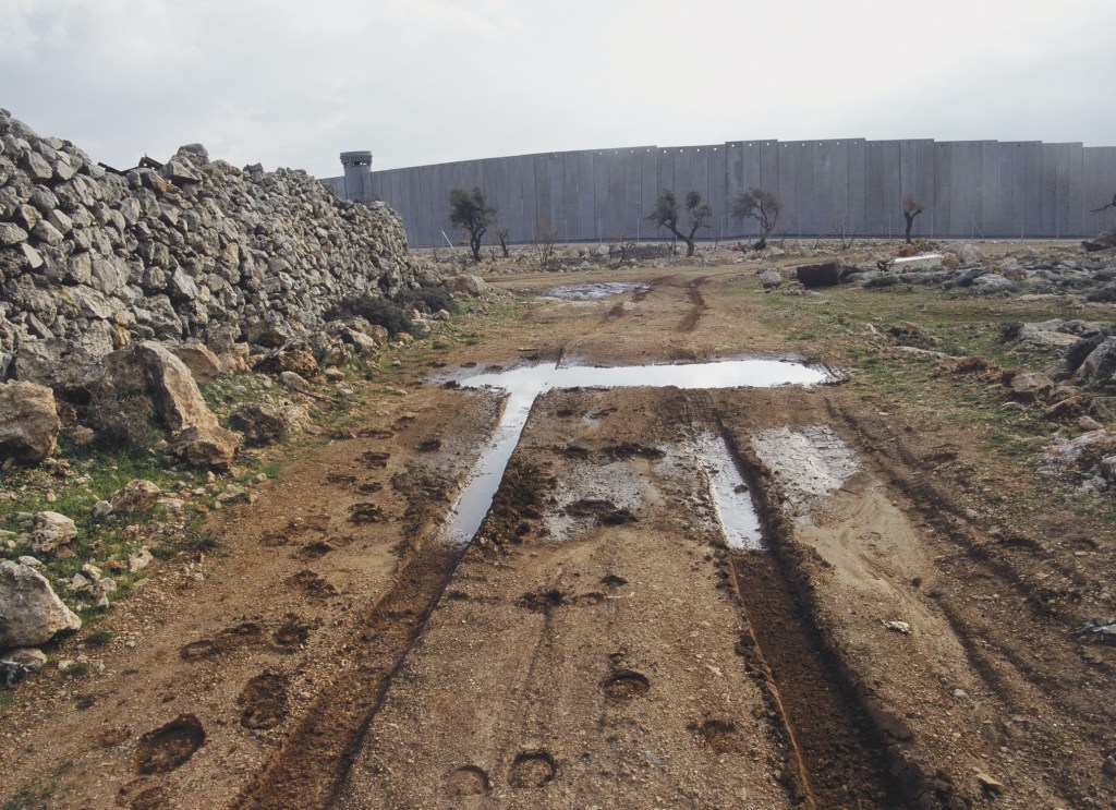
Kremer’s book draws on 6 years of exploring the sites of conflict, past and present, in his native Israel. He is largely drawn to traces, such as ruins and blast sites, but does occasionally document events, such as a speeding army vehicle. Kremer has a keen eye for line and the absurd, and grounds high-tech modern warfare in history such beehives at a blast site, the stumps of olive groves.
This image of the separation wall at Jerusalem is my favourite, as it balances simplicity with complexity, and like Pfahl’s power stations, builds tension without resolving it. It’s formally brilliant. The separation wall at first seems a continuation of the old dry stone wall, but this continuity is resolved by the watch tower, and the olive trees which provide scale. Two of the trees are dead or dying and careful attention shows them to be surrounded by the remnants of dead trees and rubble: a ruined landscape.
The straight tyre tracks lead the eye towards the trees, but must cross a dazzlingly bright puddle. Beyond this, they curve and become muddy, as if somehow damaged. Around the tracks are hoof prints – a peasant’s donkey? We are left to guess.
The mood is relentlessly bleak. The day is bright but turbulent, the colours bluish and mute. This should be a pleasant sunny scene, with its olive trees and donkeys, but all is ruined, and the only discernible fact is the grim wall and everything which it represents. There are few conflicts on the planet which are quite so divisive, and Israel’s wars with its neighbours have drawn considerable interest from artists internationally – including photographer JR and Banksy. Quite brilliantly, Kremer takes no sides. In war, he seems to say, everyone loses.
Kremer, S. 2008. Infected Landscape: Israel, Broken Promised Land. Stockport: Dewi Lewis Publishing.
Pfahl, J, & Jussim, E. 1990. A Distanced Land: the photographs of John Pfahl. Albuquerque: University of New Mexico Press.
My practice has three intentions. These overlap, and at times different intentions predominate or fade to the background.
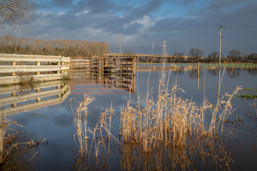
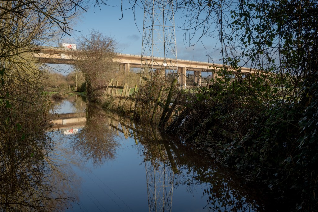
First is as a way of exploring and investigating landscape, and this is an intention found throughout my life. Certain things I see, especially the idiosyncratic, grab my attention and whether through imagining, writing or photographing, I follow this attention. Photography is special because it has given me permission to be nosy, to linger, to scrutinise, to climb over fences and into bushes to deepen that attention. It is a license to look, to deepen my connection with a place, and my work is a record of that looking. This is a personal intention. My fascination with the M5 bridge over the River Exe is founded on this curiosity and, as entirely personal, can’t really be assessed for success or weakness.
Flooding at M5 Bridge, Nr. Exeter, 2019, Andy Thatcher.Flooding at M5 Bridge, Nr. Exeter, 2019, Andy Thatcher.
These two images express perhaps better than any my intention to explore. After December’s heavy rain, the fields around the bridge were under a considerable amount of water and I was excited to discover the aesthetic possibilities and also how a landscape I have come to know intimately was changed. Had I not been out to photograph, I would not have bought a decent pair of wellies and waded carefully into the flood water to take these shots. Doing so was thrilling.
This intention is phenomenological. It is about using artistic activity to immerse myself in a place, to understand it better and engage with it on a deeper level. Director Gideon Koppel took exactly this approach for his celebrated slow-cinema documentary sleep furiously, spending 10 months in rural Wales, amassing a vast amount of footage all the while, learning at a deep level about the triumphs of a community in crisis and discovering his own relationship to the landscape and its people. It was not Koppel’s aim was not to come to any conclusive idea about Trefurig, but to document and express his experience of and interest in it. Sleep furiously is a film at Trefurig, rather than about it, and this has been my artistic strategy during the making of my two previous films, and I am exploring was of applying this at-ness to my photography.
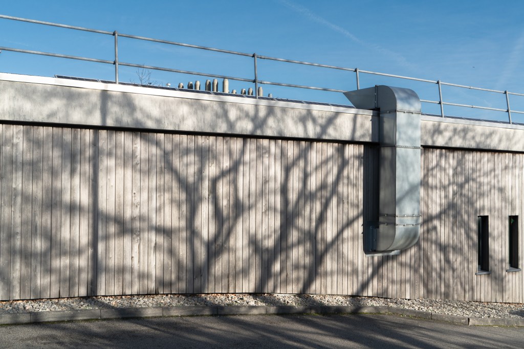
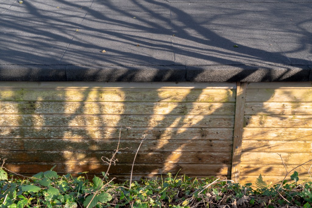
Second is to assemble a shot that pleases, whether through repositioning myself, or technological manipulations, either of the camera or in post-production. This is a formalist intention: I am interested in working with line, texture, colour, contrast. Past a certain point, I stop ‘seeing’ the contents of an image as having inherent meaning but as simply being visual forms. I have recently learned this is referred to in painting as ‘retinal’. This is generally a personal intention: I am aiming to create an image that aesthetically pleases through its ‘rightness’. When I feel I have a shot I’m happy with, I will share it, but I’m uninterested in others while I’m composing.
Falmouth University Penryn Campus, 2020. Andy Thatcher. Falmouth University Penryn Campus, 2020. Andy Thatcher.
These two shots, taken at Falmouth University Penryn Campus, illustrate successful and unsuccessful examples. Tree shadows are a fascination of mine, and one of my favourite things about late winter and early spring. The shadows are the central feature in both, and were what drew my intention. The contrast has accentuated the shadows here, and another of my other stylistic interests – bands of texture/ colour – is present in both. However, the shed photo, despite the interesting shapes of the shadows themselves, doesn’t work – the colour isn’t interesting and there aren’t other elements to balance the shadow. The wall photo works much better – the palette is pleasing, there’s an interesting dialogue between the air duct and the shadow, there’s hints of beyond the frame through the glimpsed shapes at the top and the windows, a sense of depth thanks to the road, and a simplicity added by the blue sky. The shed photo might work as a painting, but not as a photo, and this reminds me of the limitations of the medium.
This intention is formalist. It is about using manifest reality to explore the grammar of images and while I might point to other intensely formalist photographers, such as Paul Hart, it is the work of Matisse, and in particular his cut-outs, that I have in mind: the rearrangement of shapes through the viewfinder, the rebalancing of colour in Lightroom, this is a dance that recalls Matisse’s ongoing work across the walls of his hotel apartment suite in Nice in the final decade of his life, an artistic endeavour he likened to the reordering, pruning and arranging central to gardening. While there is less freedom, clearly, with photography, there is considerable scope for rearrangement of shape and texture prior to releasing the shutter and rearrangement of colour and light in post-production. Like Matisse’s cutouts, photography is itself a hybrid form. Like them also, digital photography’s form lends itself to provisionality and ongoing revision, making formal playfulness an inherent possibility.
Third is the intention to create a shot that evokes, and this does involve others because it is the communicative aim of the image. I might aim to evoke an idea – such as the legal fragility of public access to land – or I might aim to evoke a sensory or emotive experience – such as the wind through reeds, the wonder of a frosty dawn over flooded fields. I will occasionally take a picture solely for this purpose, and draw on the picturesque in doing so, simply because something I encounter suggests itself, such as a vista through an opening in a hedgerow; doing this is simply because I know it will cause pleasure for others.
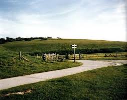
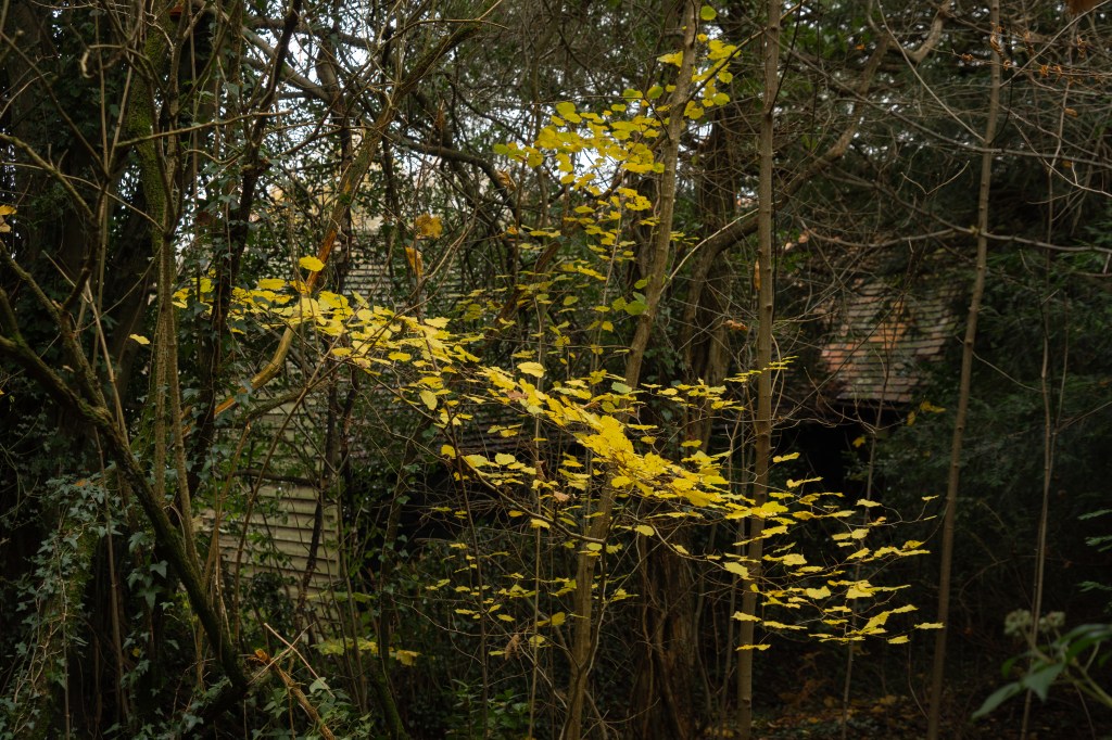
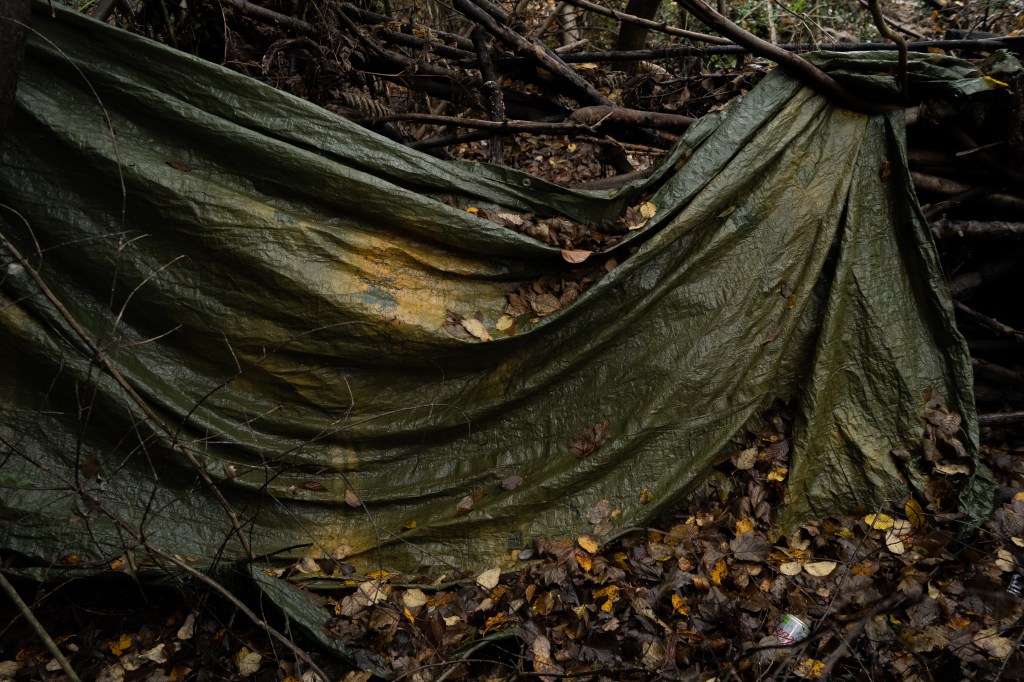
Tunbridge Wells Common, December 2019. Andy Thatcher. Tunbridge Wells Common, December 2019. Andy Thatcher. Tunbridge Wells Common, December 2019. Andy Thatcher.
The view of Tunbridge Wells Common neither evokes nor provides an especially pleasing vista. The composition is fine, but the light and colour are uninteresting, and this demonstrates how views can often fail to evoke the places they capture where a less pictorial image succeeds – such as the second shot. I was very happy with this – it evokes both the season, the denseness of the wooded common, and also the sense of discovery, through the (very typically Kentish) buildings glimpsed in the background. It is, I hope, also pleasing, as I found the shape of the leaves against the dark background very elegant. The image of the tarp – the remnants of a hidden drug den – is both evocative of the thick, sinister holly and rhododendron undergrowth at the bottom of the common, and also evidence of conflicting ideas of land use, and manmade despoilation of the natural environment. I also like it aesthetically – the lines are dramatic – and it was this primarily which drew me to take it.
This balancing of the sensory and the political, of both experience and meaning of place, is central to the work of Fay Godwin, one of the first photographers I encountered whose work I believed I could learn something important from. Godwin’s interest, like mine, is not didactic – though her work is heavily political. She is drawn, she says, to land that has been ‘worked’, while ‘wilderness areas’ such as the American West, ‘have fewer resonances’. Speaking of photographing the Scottish Highlands, she talks in terms of getting across both the sense of bleakness, and also of strategically choosing viewpoints to combine different layers of history, such as a barrow and a castle. Godwin’s work is thus both at the places she photographs and very much about them.
During Informing Contexts I want to explore ways of translating and expressing phenomenological and ideological experiences of landscape, both my own and that of others, by theoretical research, close evaluation of other photographers’ work, and personal experimentation, including informal interviews. I want to deepen my awareness of the contemporary and historic aesthetics and ideologies of the landscape idiom across the visual arts. Aesthetically and technically, I want to deepen an understanding of the relationship between line and texture, colour manipulation and combination, the use of dusk lighting conditions, and the sequencing logic of series. I want this term to be about establishing a basis for future work, rather than conducting in-depth investigation. Likewise, I want my photography to focus on experimentation rather than refining towards a polished, finished outcome. I will continue to learn about commons, immerse myself in nature writing and engage personally with common land, including as a volunteer at the Pebblebed Heaths Conservation Trust. I have a considerable reading list and will continue to work my way through this, and develop any productive or promising new areas illuminated through course learning materials and activities.
Bibliography.
Buchberg, K., et al. (eds.) 2014. Henri Matisse: The Cut-Outs. London: Tate Publishing.
Godwin, F. 1990. Our Forbidden Land. London: Jonathan Cape.
Koppel, G. 2007. Documentary – the evocation of a world. Journal of Media Practice, 8. pp. 305-323.
Newland, P. 2016. sleep furiously: interview with Gideon Koppel. In Newland (ed.) British Rural Landscapes on Film. Manchester: Manchester University Press. pp. 180-189.
Wood, J. 2014. Gideon Koppel. In Wood (ed.) Last Words: Considering Contemporary Cinema. New York: Wallflower Press. pp. 60-65.
Audiovisual works.
sleep furiously. [feature film] Dir. Gideon Koppel. Bard Entertainments, Van Films. UK. 2009. 94 mins.
The South Bank Show: Fay Godwin [TV episode]. Dir. Unknown. London Weekend Television. UK. 1986. 50 mins.
Art, like culture, society, nature, self, is a slippery term with multiple meanings. Art has a perennially contested, perennially shifting social meaning. Matisse’ breakthrough work was dismissed as ‘decoration’ rather than art by the French establishment, and the phenomenon of ‘outsider art’ shows how creative work overlooked in one era can become celebrated art in another. This being the case, all the photographic works in this presentation can be considered ‘art’ simply because establishment figures have considered them as such, often stressing the validity of the work as ‘art’ in financial terms.
However, and this is of much greater interest to me, art has a personal dimension, and I believe we each have our own subjective working definition of what art is – and perhaps just as important, what it isn’t, as seen by the ongoing popular antipathy to Tracy Emin’s bed. My working definition is a creative piece that is both intellectually and technically rigorous, whatever medium is being used (and this can include beds), and that has the ability not just to engage the viewer, but to involve them. Art might involve me in ways that I don’t enjoy – such as the work of Francis Bacon – or in ways that I do – such as the work of Georgia O’Keefe. Where something considered ‘art’ leaves me cold, as with the paintings of Rothko, I defer to a respect for technical proficiency and personal vision (more on that later). Where none of these apply, I will grudgingly go along with the fact that it’s ‘art’ because other people say it is. As, I’m afraid, with the work of Cindy Sherman (more on that later, too).
How important are the principles of photographic craft skills?
I think that depends on what you define as these skills. Art, for me, is the understanding and use of the medium to communicate. Eggleston’s understanding of dye, Adams’ understanding of chemistry, these are irrelevant if you’ve chosen to use the Polaroid as your camera, and yet Wim Wenders’ understanding of the limitations and possibilities of this mass-market device, never intended for artistic production, is arguably as skilful as either of these. And, anyway, are the craft skills the same as technical skills? Mise en scene is adopted from theatrical via cinema and yet crucial for much postmodern photography. I think the question should be ‘How important is the ability to match intention with image outcome?’ To that question, I would answer: essential.
How important is the idea of the photographer as subjective author?
While there are numerous critical positions on this, I am, again, answering personally as I think this is the most productive for my practice. For me, the idea is incredibly important, although it needs to be said adding ‘subjective’ to author is somewhat redundant – there could never be such a thing as ‘objective’ author, even were that author to be the author of the most empiricist of science reports. I look to photographers whose work I know will give me pleasure, educate me both technically and politically, and inspire my own work. I will be drawn to specific styles, themes and experiences; that their work carries their name as author’s helps me do this. In a world drowning in images, this is perhaps now more important than ever.
That said, I’m of course aware that there can never be any ‘sole’ author – every photographer is borrowing from their own experience of culture, and with photography in particular there are other agencies inherent in the image itself, whether of the camera, lens, film etc, or the articles which enter through the lens, signage, facial expressions, and agents beyond human culture. I am also aware that I will bring my own subjectivity to bear, that I will recreate the image myself each time afresh – there can never be an accurate reproduction where factors such as light, screen warmth, paper type, differences in eyesight, personal experience, and psychological cognition. Nevertheless, I will be drawn to a book of Stephen Shore’s photographs because through his authorship, all these factors are able to mix in a largely reliable way that will chime with what I wish to find.
Where do you position your own practice with regard to the ideas of postmodern photography?
I flirted with the postmodern as a writer, and spent considerable time exploring the postmodern novel. The postmodern has its potentials and its charms – but also its pitfalls. It lends itself to solipsism and needless difficulty. While claiming to embrace the popular and commonplace, much postmodern art – from literature to architecture to photography – needs explaining to be appreciated, and often feels like an intellectual and exclusive in-joke. If you don’t get the joke, it’s hard to appreciate on its own merits, and this is perhaps why it often falls flat outside of intellectual circles. I thought the film clip from Zoo (Salla Tykka, 2006) was awful, frankly: without notable aesthetic merit nor with anything particularly interesting to say for itself. At its best, the postmodern is joyfully playful: here the play was in deadly earnest. I feel similarly, though less strongly, about the work of Cindy Sherman. As for Richard Prince, my feelings are – yes, I see what you’re saying, very clever, but so what? Who cares?
Calling attention to artistic constructedness and the motives behind creation is nothing new – it’s traceable at least back to Don Quixote – but has been a prevalent force since Marcel DuChamp. Personally, I find it a spent force. Creative activity can be turned towards a great number of things, and self-referentiality feels to me an unnecessary weight. I believe it’s long been time to move on to other things. In short, in relation to my practice I don’t care about the postmodern – I’m simply not interested in those conversations any more.
Do we simply live in a world of recycled images?
Yes, of course we do. We live in a world of recycled everything. Surely nothing is more recycled than language – and yet we each find our own distinctive position in relation to it. We each of us use language and the power structures inherent in it in our own way. This is why I find Bakhtin’s theory of dialogism a more open, less cynical and ultimately more empowering account of the constructedness of culture.
Can we be original any more?
That surely depends on what one means by original. In Joel Sternfeld’s On This Site (1996) there’s a picture of a kitchen and on the fridge is a quote from Carl Sagan: If you wish to make an apple pie from scratch, you must first create the whole universe. In other words, the idea of true originality is a myth. It’s how we combine the elements we find that counts, even if the alterations we make to a pre-existing set of circumstances and materials are very subtle. One might also say that striving above all for originality is simply another expression of the worship of individualism. If that’s the case, it’s perhaps not such a great thing to strive for. I’d much rather get on with making the apple pie.
Sternfeld, J. 1996. On This Site. San Francisco: Chronicle Books.
Zoo [short film]. Dir. Tykka, S. Finland. 2006. 12 mins.
I’ve been keen to see both these photobooks for a while as each is expressing something specific, and quite different, about place: Morris’ personal, bittersweet documenting of contemporary Wales, Sternfeld’s exploration of sites of a range of violence, including land theft, industrial negligence, spree shooting, abduction, assassination, police brutality and rape.
Sternfeld is a photographer working in a manner more akin to my inclinations. This is not a peopled landscape and Sternfeld uses a variety of framing strategies. His images are composed with a keen eye for line and leading the viewer through the image, often abruptly throwing the eye across the frame and out the other side, at other times drawing the eye into the frame through perspectival lines. Some objects – a bus stop, a decaying store, a pile of rubble – are centred and the image largely flat. Specific motifs recurr – gates, snow (sometimes very deftly used) and golden light. Sternfeld often uses long exposure times, blurring water, trees, a bird, and distant people, and this provides a gently surreal touch without calling too much attention to self-reflexivity. The images by themselves are quiet, suggestive and often beautiful.
The role of text is indispensible. Sternfelds language is plain and unemotive, though not cold, and a dialogue between image and text emerges, each re-enforcing and developing the other. The use of space and the lack of people allows space for the viewer to pause and imagine for themselves, while the strong use of coherent style communicates Sternfeld’s role as witness – and fellow traveller, fellow imaginer. The strong contextual details – time of day, season – give a sense of the place as a living place, not simply a stage. This abstracts the event – even where there is evidence of it such as memorials, the collective effect of the empty places bleeds through. The series is chronological, with events largely taken from the 10 years prior to the 1996 publication date. I believe I have much to learn from this work.
I had previously only seen large format photographs from Morris’ book, which reminded me of the work of John Davies. The large format photographs form a coherent group here, and are glorious. However, I felt the range of styles was too wide, and in particular I didn’t find Morris’ more documentary images, many of the Welsh seaside, to communicate much, nor to be aesthetically interesting. This is perhaps simply a matter of personal preference, but having loved the documentary seaside work of Tony Ray-Jones and Marketa Luskakova, I’m not so sure. Morris does not somehow seem to establish a coherent style as does Sternfeld, something I’m addressing in my own work, although where there is consistency, such as the large format views or – particularly – the street views, which sometimes flirt with abstractions – these are a joy.
The sequencing is interesting, however, and I think something I can learn from. Morris makes thematic links running between double spreads, leading the viewer through Wales, so it feels, and dividing the experience unobtrusively into segments through the occasional use of a blank white page. Many of the double spread pairings are inspired – particularly that of Popton Refinery and Caerfilli Castle, both structures filling an identically sized band of structure in the middle of each shot, each separated from the viewer by infrastructure such as gates and lights. Indeed, this pairing could be said to sum up the Wales that Morris is trying to demonstrate – contextualising heritage and industry amongst contemporary crass banality, celebrating the persistence of culture while critiquing myth-making.
Morris, J. 2010. A Landscape of Wales. Stockport: Dewi Lewis Publishing.
Sternfeld, J. 1996. On This Site. San Francisco: Chronicle Books.
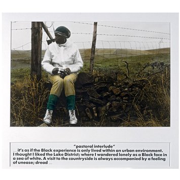
I got talking to an art historian last night who specialises in black women artists of the 1980’s. The historian knows Pollard very well, and it’s a name I’ve come across a few times and meant to check out – as her landscape photography is highly political and very subjective. This is from her book Pastoral interlude, from 1988.
The photo has an extraordinary depth and a great many layers of meaning. The photographic process – hand tinting – takes the viewer first back to the nostalgia of hand tinted postcards, but then, when weighed against the subject of a black woman, one encounters the prejudices and exploitation of the British Empire. Nostalgia is challenged just as the present, with its prejudices and exploitations, is contextualised by an ever-present past.
Pollard’s pose likewise unsettles. Sitting on a dry stone wall, knees bent inwards, her posture, and her clothes, are identical to any female rambler. However, her very dark skin contrasts with the white coat, her headscarf bulges as if hiding dreadlocks, and again the familiar is unsettled, something that is echoed in the text: we feel Pollard’s unease.
As elsewhere in the book, Pollard is excluded from the landscape – here explicitly by the wall and the barbed wire, but also implicitly, hemmed in by the framing fence posts. In fact, the vista occupies only a fraction of the photo, and appears flat, an almost abstract stripe of largely uniform texture.
But Pollard is victorious. The camera in her lap is an expression of agency and power. Her partial profile accentuates her strong facial features and, like the camera, the force of her gaze – though both are directed far away from the recording lens. Moreover, Pollard’s skin tone is precisely echoed in the dry stone wall, perhaps the most archetypal symbol of the Lake District. While Pollard remains separate from the landscape, she is one with the power structures which define it.


You must be logged in to post a comment.