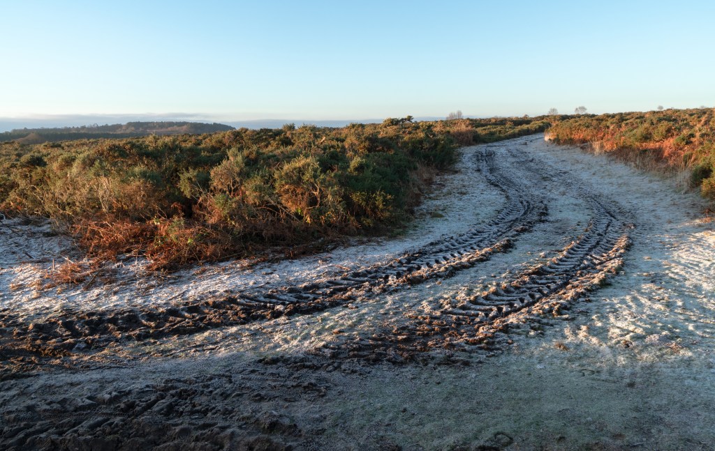
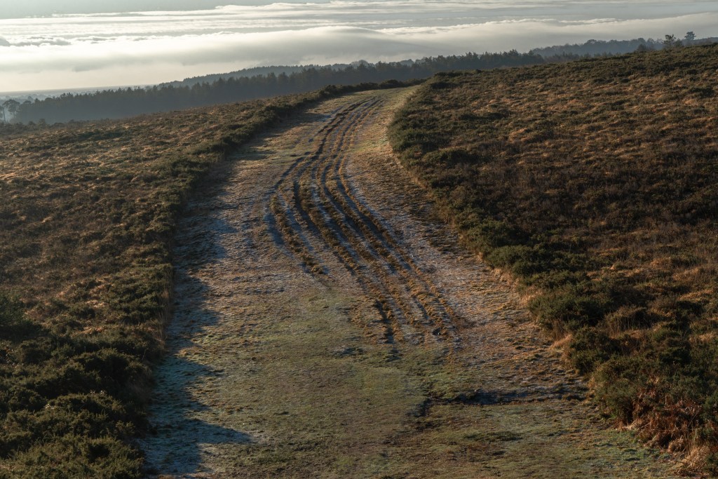
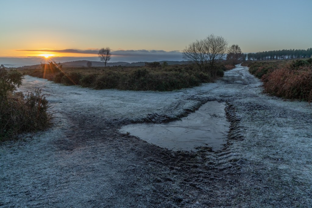
I’ve been up to the Pebblebed Heaths several times without discussing these here. I’m still finding my way around what I want from them personally. Stylistically, I’m attracted to the paths, especially where these braid or are rutted by heavy machinery, as these give me the striking lines I’ve enjoyed so much enjoyed in photographing the M5 bridge at Exminster/ Topsham. Yesterday’s shoot was particularly successful, as the frost picked the lines out still further – something that can be problematic where there is deep shadow or a lack of contrast in overcast conditions.
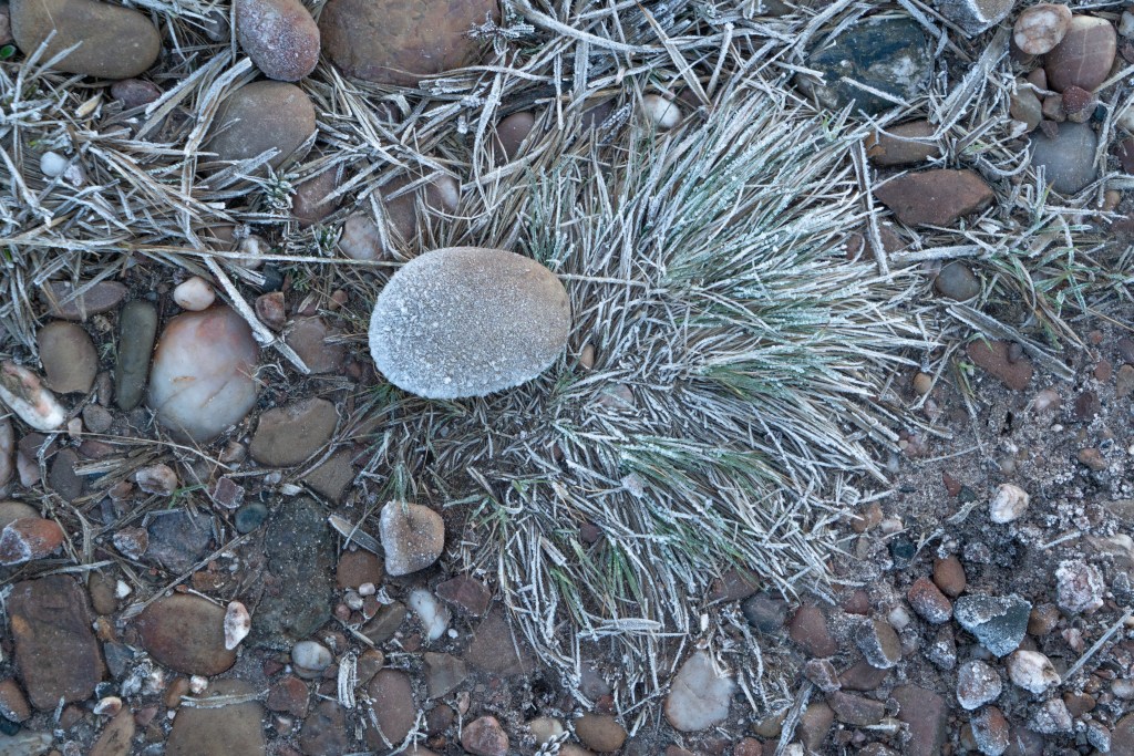
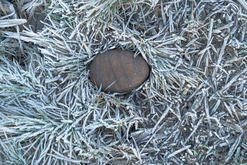
Likewise, I’m continuing my explorations of the ground with the ‘pebble portraits’. The pebbles are a central part of the heath and I think should form a major focus in a photographic exploration – I’m going to challenge myself to tell as much through these about land use (bike tracks, dog prints) and the seasons (acorns, frost). The pebbles are often visually arresting and I should choose pebbles for their attractiveness as well as their context.
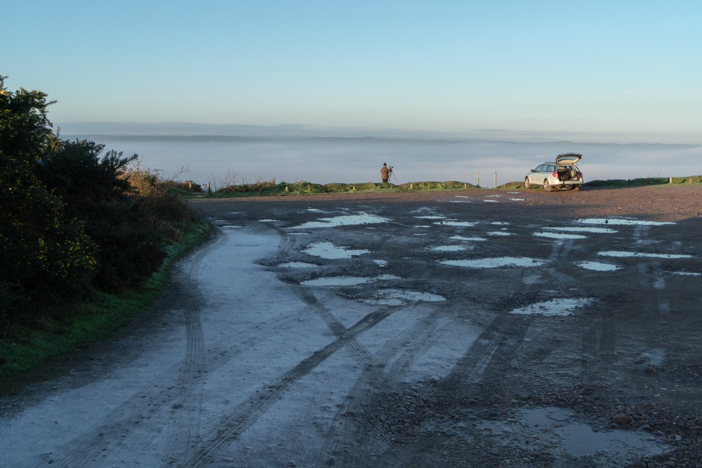
I’m also considering ways to use the picturesque. I think this is important in capturing what the heaths ‘mean’ to their users, as the visual sense is formed by cultural experience, whether or not a photograph is being taken. I could do this unproblematically by following the aesthetics of attractive amateur photography, I could represent the picturesque being formed through photographing photographers, or I could subvert standard picturesque content. All three tactics are demonstrated below.
Picturesque icy scene (albeit disturbed slightly by prominent tyre tracks)Photographer capturing mist. Mist slightly abstracted by banding and lacking strong detail.
I’m in the process of discovering the dimensions and uses of my practice. By dimensions, I mean the formal style, subject and tone of my work. Within the broad genre of landscape photography, my practice presently incorporates the abstract, the sensory-impressionistic, the unsettling, the picturesque and the documentary and I feel this needs some refining and focussing to bring these elements together, or by eschewing one in favour of another. I have a clear preference for bold lines but am developing a deeper engagement with texture and am in the process of learning more about colour, through experimentation and research, to help develop a more coherent, distinctive personal style. I am continuing to photograph commons and am deepening my relationship to the Pebblebed Heaths in East Devon and with Tunbridge Wells common. I also continue to photograph when walking elsewhere to train and develop my eye. My 18 month engagement with Exeter’s M5 bridge feels to be in its closing stages, other than to record seasonal events such as snow or the reeds in flower.
By uses, I mean the outputs for my work. I am presently developing ideas for my M5 photographs and believe a book with a strong written component would be the best end product, with an accompanying exhibition. I’m getting ideas and support from my network and considering how I might apply for AHRC funding for this. I’m in the process of setting up a 3 month project with Devon Wildlife Trust to provide material to promote Exeter’s Valley Parks, and which may include film as well as photography. I’m also in discussion with Pebblebed Heaths Conservation Trust, who manage Devon’s newest National Nature Reserve and will be launching as such publicly in May; our interests in sense of place exactly coincide and whether or not funding might be available for my work, the timing is fortuitous. I am also acquiring a working understanding of the principles of anthropology and learning how photography is used in ethnographic, especially sensory ethnographic, research beyond simply providing accompanying data or illustration.
In short, 2020 looks to be an interesting year for my practice.
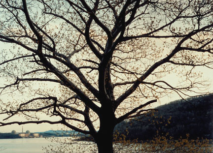
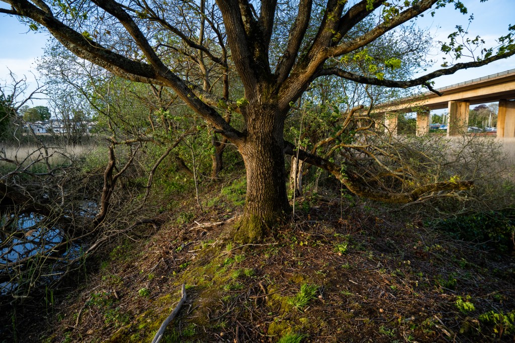
It is a wonderful experience when you find a photographer of enormous skill who seeks out the same things as you. It’s a validation, a challenge, and an education in how much better you could do what you do. This is absolutely the case with Pfahl’s 1982 series Power Places, which I’ve come across in the retrospective A Distanced Land. While Pfhal uses the power plants as the starting point in all his images, each is about what he finds more generally: Pfahl explores a landscape, develops his own relationship to it and his own fascinations and embeds the ‘power places’ within that. Paradoxically, this throws perhaps even more stress on his subject, and through making it smaller it is often somehow more dominant, drawing the attention again and again. This is one major aspect of my M5 Exeter bridge project – although I have also used many images up very close indeed. To demonstrate this, and without in any way suggesting our photography is equal, I’ve included a photo of my own below Pfahl’s – taken long before I’d registered for this Masters course, let alone even hearing of Pfahl.
Pfahl’s image is dominated by the tree. Other photos of other power stations are dominated by mountains, clouds, water, scrub. On a formal level, the framing in exquisite, the tree filling the frame but, so it appears, making room for the power station while blending in with the wooded river bank. The messy late autumn textures and veinlike branches and dull colours are thrown into disorder by the power plant’s geometric shapes, and pale yellow and red. The eye is drawn back to it again and again like an itch that needs scratching.
Pfahl took pains to present the power plants neutrally. He invites the viewer to respond for themselves, and was amused that both anti- and pro-nuclear groups believed him to be on their side. The plants are embedded in the landscape, he seems to be saying. They are part of it. Whether this is a good thing or not is in the personal response. ‘A tension is created’, he said, ‘that cries out for resolution.’
Kremer’s book draws on 6 years of exploring the sites of conflict, past and present, in his native Israel. He is largely drawn to traces, such as ruins and blast sites, but does occasionally document events, such as a speeding army vehicle. Kremer has a keen eye for line and the absurd, and grounds high-tech modern warfare in history such beehives at a blast site, the stumps of olive groves.
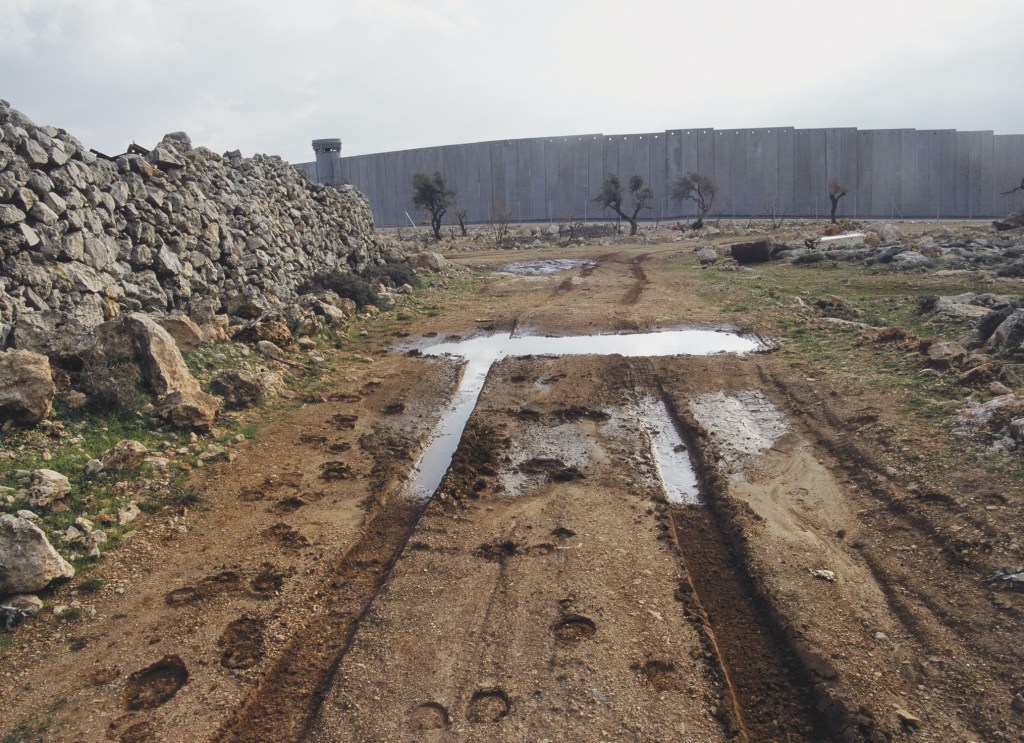
This image of the separation wall at Jerusalem is my favourite, as it balances simplicity with complexity, and like Pfahl’s power stations, builds tension without resolving it. It’s formally brilliant. The separation wall at first seems a continuation of the old dry stone wall, but this continuity is resolved by the watch tower, and the olive trees which provide scale. Two of the trees are dead or dying and careful attention shows them to be surrounded by the remnants of dead trees and rubble: a ruined landscape.
The straight tyre tracks lead the eye towards the trees, but must cross a dazzlingly bright puddle. Beyond this, they curve and become muddy, as if somehow damaged. Around the tracks are hoof prints – a peasant’s donkey? We are left to guess.
The mood is relentlessly bleak. The day is bright but turbulent, the colours bluish and mute. This should be a pleasant sunny scene, with its olive trees and donkeys, but all is ruined, and the only discernible fact is the grim wall and everything which it represents. There are few conflicts on the planet which are quite so divisive, and Israel’s wars with its neighbours have drawn considerable interest from artists internationally – including photographer JR and Banksy. Quite brilliantly, Kremer takes no sides. In war, he seems to say, everyone loses.
Kremer, S. 2008. Infected Landscape: Israel, Broken Promised Land. Stockport: Dewi Lewis Publishing.
Pfahl, J, & Jussim, E. 1990. A Distanced Land: the photographs of John Pfahl. Albuquerque: University of New Mexico Press.
My practice has three intentions. These overlap, and at times different intentions predominate or fade to the background.
First is as a way of exploring and investigating landscape, and this is an intention found throughout my life. Certain things I see, especially the idiosyncratic, grab my attention and whether through imagining, writing or photographing, I follow this attention. Photography is special because it has given me permission to be nosy, to linger, to scrutinise, to climb over fences and into bushes to deepen that attention. It is a license to look, to deepen my connection with a place, and my work is a record of that looking. This is a personal intention. My fascination with the M5 bridge over the River Exe is founded on this curiosity and, as entirely personal, can’t really be assessed for success or weakness.
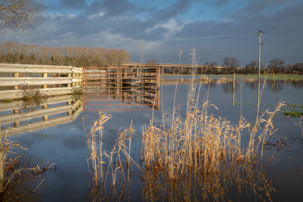
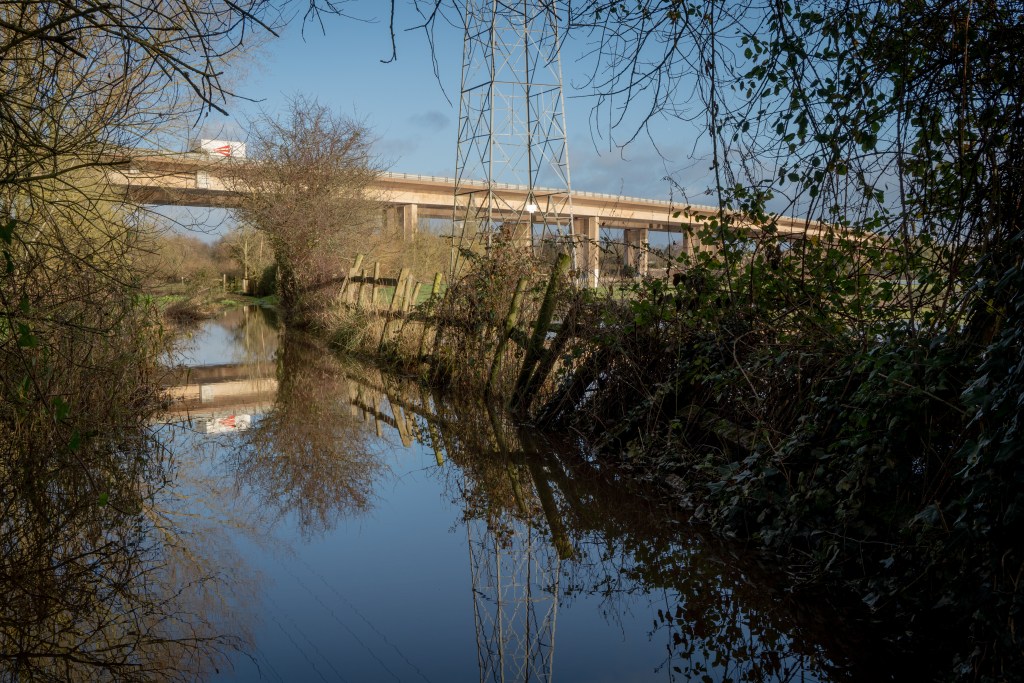
Flooding at M5 Bridge, Nr. Exeter, 2019, Andy Thatcher.Flooding at M5 Bridge, Nr. Exeter, 2019, Andy Thatcher.
These two images express perhaps better than any my intention to explore. After December’s heavy rain, the fields around the bridge were under a considerable amount of water and I was excited to discover the aesthetic possibilities and also how a landscape I have come to know intimately was changed. Had I not been out to photograph, I would not have bought a decent pair of wellies and waded carefully into the flood water to take these shots. Doing so was thrilling.
This intention is phenomenological. It is about using artistic activity to immerse myself in a place, to understand it better and engage with it on a deeper level. Director Gideon Koppel took exactly this approach for his celebrated slow-cinema documentary sleep furiously, spending 10 months in rural Wales, amassing a vast amount of footage all the while, learning at a deep level about the triumphs of a community in crisis and discovering his own relationship to the landscape and its people. It was not Koppel’s aim was not to come to any conclusive idea about Trefurig, but to document and express his experience of and interest in it. Sleep furiously is a film at Trefurig, rather than about it, and this has been my artistic strategy during the making of my two previous films, and I am exploring was of applying this at-ness to my photography.
Second is to assemble a shot that pleases, whether through repositioning myself, or technological manipulations, either of the camera or in post-production. This is a formalist intention: I am interested in working with line, texture, colour, contrast. Past a certain point, I stop ‘seeing’ the contents of an image as having inherent meaning but as simply being visual forms. I have recently learned this is referred to in painting as ‘retinal’. This is generally a personal intention: I am aiming to create an image that aesthetically pleases through its ‘rightness’. When I feel I have a shot I’m happy with, I will share it, but I’m uninterested in others while I’m composing.
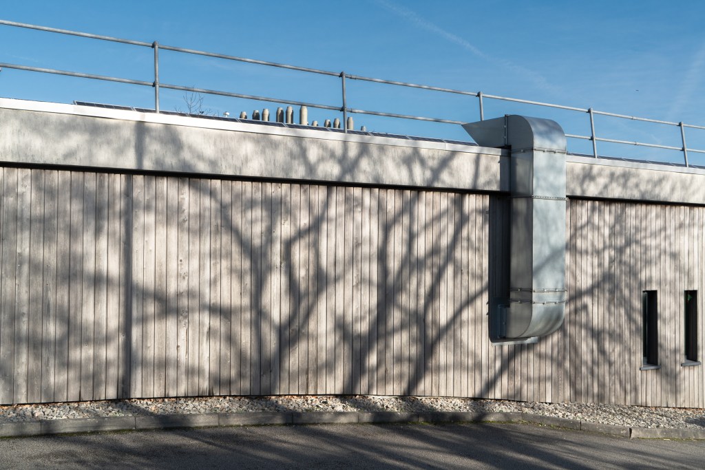
Falmouth University Penryn Campus, 2020. Andy Thatcher. Falmouth University Penryn Campus, 2020. Andy Thatcher.
These two shots, taken at Falmouth University Penryn Campus, illustrate successful and unsuccessful examples. Tree shadows are a fascination of mine, and one of my favourite things about late winter and early spring. The shadows are the central feature in both, and were what drew my intention. The contrast has accentuated the shadows here, and another of my other stylistic interests – bands of texture/ colour – is present in both. However, the shed photo, despite the interesting shapes of the shadows themselves, doesn’t work – the colour isn’t interesting and there aren’t other elements to balance the shadow. The wall photo works much better – the palette is pleasing, there’s an interesting dialogue between the air duct and the shadow, there’s hints of beyond the frame through the glimpsed shapes at the top and the windows, a sense of depth thanks to the road, and a simplicity added by the blue sky. The shed photo might work as a painting, but not as a photo, and this reminds me of the limitations of the medium.
This intention is formalist. It is about using manifest reality to explore the grammar of images and while I might point to other intensely formalist photographers, such as Paul Hart, it is the work of Matisse, and in particular his cut-outs, that I have in mind: the rearrangement of shapes through the viewfinder, the rebalancing of colour in Lightroom, this is a dance that recalls Matisse’s ongoing work across the walls of his hotel apartment suite in Nice in the final decade of his life, an artistic endeavour he likened to the reordering, pruning and arranging central to gardening. While there is less freedom, clearly, with photography, there is considerable scope for rearrangement of shape and texture prior to releasing the shutter and rearrangement of colour and light in post-production. Like Matisse’s cutouts, photography is itself a hybrid form. Like them also, digital photography’s form lends itself to provisionality and ongoing revision, making formal playfulness an inherent possibility.
Third is the intention to create a shot that evokes, and this does involve others because it is the communicative aim of the image. I might aim to evoke an idea – such as the legal fragility of public access to land – or I might aim to evoke a sensory or emotive experience – such as the wind through reeds, the wonder of a frosty dawn over flooded fields. I will occasionally take a picture solely for this purpose, and draw on the picturesque in doing so, simply because something I encounter suggests itself, such as a vista through an opening in a hedgerow; doing this is simply because I know it will cause pleasure for others.
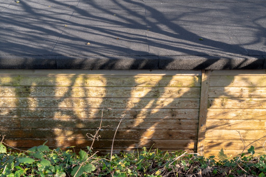
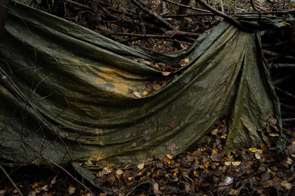
Tunbridge Wells Common, December 2019. Andy Thatcher. Tunbridge Wells Common, December 2019. Andy Thatcher. Tunbridge Wells Common, December 2019. Andy Thatcher.
The view of Tunbridge Wells Common neither evokes nor provides an especially pleasing vista. The composition is fine, but the light and colour are uninteresting, and this demonstrates how views can often fail to evoke the places they capture where a less pictorial image succeeds – such as the second shot. I was very happy with this – it evokes both the season, the denseness of the wooded common, and also the sense of discovery, through the (very typically Kentish) buildings glimpsed in the background. It is, I hope, also pleasing, as I found the shape of the leaves against the dark background very elegant. The image of the tarp – the remnants of a hidden drug den – is both evocative of the thick, sinister holly and rhododendron undergrowth at the bottom of the common, and also evidence of conflicting ideas of land use, and manmade despoilation of the natural environment. I also like it aesthetically – the lines are dramatic – and it was this primarily which drew me to take it.
This balancing of the sensory and the political, of both experience and meaning of place, is central to the work of Fay Godwin, one of the first photographers I encountered whose work I believed I could learn something important from. Godwin’s interest, like mine, is not didactic – though her work is heavily political. She is drawn, she says, to land that has been ‘worked’, while ‘wilderness areas’ such as the American West, ‘have fewer resonances’. Speaking of photographing the Scottish Highlands, she talks in terms of getting across both the sense of bleakness, and also of strategically choosing viewpoints to combine different layers of history, such as a barrow and a castle. Godwin’s work is thus both at the places she photographs and very much about them.
During Informing Contexts I want to explore ways of translating and expressing phenomenological and ideological experiences of landscape, both my own and that of others, by theoretical research, close evaluation of other photographers’ work, and personal experimentation, including informal interviews. I want to deepen my awareness of the contemporary and historic aesthetics and ideologies of the landscape idiom across the visual arts. Aesthetically and technically, I want to deepen an understanding of the relationship between line and texture, colour manipulation and combination, the use of dusk lighting conditions, and the sequencing logic of series. I want this term to be about establishing a basis for future work, rather than conducting in-depth investigation. Likewise, I want my photography to focus on experimentation rather than refining towards a polished, finished outcome. I will continue to learn about commons, immerse myself in nature writing and engage personally with common land, including as a volunteer at the Pebblebed Heaths Conservation Trust. I have a considerable reading list and will continue to work my way through this, and develop any productive or promising new areas illuminated through course learning materials and activities.
Bibliography.
Buchberg, K., et al. (eds.) 2014. Henri Matisse: The Cut-Outs. London: Tate Publishing.
Godwin, F. 1990. Our Forbidden Land. London: Jonathan Cape.
Koppel, G. 2007. Documentary – the evocation of a world. Journal of Media Practice, 8. pp. 305-323.
Newland, P. 2016. sleep furiously: interview with Gideon Koppel. In Newland (ed.) British Rural Landscapes on Film. Manchester: Manchester University Press. pp. 180-189.
Wood, J. 2014. Gideon Koppel. In Wood (ed.) Last Words: Considering Contemporary Cinema. New York: Wallflower Press. pp. 60-65.
Audiovisual works.
sleep furiously. [feature film] Dir. Gideon Koppel. Bard Entertainments, Van Films. UK. 2009. 94 mins.
The South Bank Show: Fay Godwin [TV episode]. Dir. Unknown. London Weekend Television. UK. 1986. 50 mins.
Art, like culture, society, nature, self, is a slippery term with multiple meanings. Art has a perennially contested, perennially shifting social meaning. Matisse’ breakthrough work was dismissed as ‘decoration’ rather than art by the French establishment, and the phenomenon of ‘outsider art’ shows how creative work overlooked in one era can become celebrated art in another. This being the case, all the photographic works in this presentation can be considered ‘art’ simply because establishment figures have considered them as such, often stressing the validity of the work as ‘art’ in financial terms.
However, and this is of much greater interest to me, art has a personal dimension, and I believe we each have our own subjective working definition of what art is – and perhaps just as important, what it isn’t, as seen by the ongoing popular antipathy to Tracy Emin’s bed. My working definition is a creative piece that is both intellectually and technically rigorous, whatever medium is being used (and this can include beds), and that has the ability not just to engage the viewer, but to involve them. Art might involve me in ways that I don’t enjoy – such as the work of Francis Bacon – or in ways that I do – such as the work of Georgia O’Keefe. Where something considered ‘art’ leaves me cold, as with the paintings of Rothko, I defer to a respect for technical proficiency and personal vision (more on that later). Where none of these apply, I will grudgingly go along with the fact that it’s ‘art’ because other people say it is. As, I’m afraid, with the work of Cindy Sherman (more on that later, too).
How important are the principles of photographic craft skills?
I think that depends on what you define as these skills. Art, for me, is the understanding and use of the medium to communicate. Eggleston’s understanding of dye, Adams’ understanding of chemistry, these are irrelevant if you’ve chosen to use the Polaroid as your camera, and yet Wim Wenders’ understanding of the limitations and possibilities of this mass-market device, never intended for artistic production, is arguably as skilful as either of these. And, anyway, are the craft skills the same as technical skills? Mise en scene is adopted from theatrical via cinema and yet crucial for much postmodern photography. I think the question should be ‘How important is the ability to match intention with image outcome?’ To that question, I would answer: essential.
How important is the idea of the photographer as subjective author?
While there are numerous critical positions on this, I am, again, answering personally as I think this is the most productive for my practice. For me, the idea is incredibly important, although it needs to be said adding ‘subjective’ to author is somewhat redundant – there could never be such a thing as ‘objective’ author, even were that author to be the author of the most empiricist of science reports. I look to photographers whose work I know will give me pleasure, educate me both technically and politically, and inspire my own work. I will be drawn to specific styles, themes and experiences; that their work carries their name as author’s helps me do this. In a world drowning in images, this is perhaps now more important than ever.
That said, I’m of course aware that there can never be any ‘sole’ author – every photographer is borrowing from their own experience of culture, and with photography in particular there are other agencies inherent in the image itself, whether of the camera, lens, film etc, or the articles which enter through the lens, signage, facial expressions, and agents beyond human culture. I am also aware that I will bring my own subjectivity to bear, that I will recreate the image myself each time afresh – there can never be an accurate reproduction where factors such as light, screen warmth, paper type, differences in eyesight, personal experience, and psychological cognition. Nevertheless, I will be drawn to a book of Stephen Shore’s photographs because through his authorship, all these factors are able to mix in a largely reliable way that will chime with what I wish to find.
Where do you position your own practice with regard to the ideas of postmodern photography?
I flirted with the postmodern as a writer, and spent considerable time exploring the postmodern novel. The postmodern has its potentials and its charms – but also its pitfalls. It lends itself to solipsism and needless difficulty. While claiming to embrace the popular and commonplace, much postmodern art – from literature to architecture to photography – needs explaining to be appreciated, and often feels like an intellectual and exclusive in-joke. If you don’t get the joke, it’s hard to appreciate on its own merits, and this is perhaps why it often falls flat outside of intellectual circles. I thought the film clip from Zoo (Salla Tykka, 2006) was awful, frankly: without notable aesthetic merit nor with anything particularly interesting to say for itself. At its best, the postmodern is joyfully playful: here the play was in deadly earnest. I feel similarly, though less strongly, about the work of Cindy Sherman. As for Richard Prince, my feelings are – yes, I see what you’re saying, very clever, but so what? Who cares?
Calling attention to artistic constructedness and the motives behind creation is nothing new – it’s traceable at least back to Don Quixote – but has been a prevalent force since Marcel DuChamp. Personally, I find it a spent force. Creative activity can be turned towards a great number of things, and self-referentiality feels to me an unnecessary weight. I believe it’s long been time to move on to other things. In short, in relation to my practice I don’t care about the postmodern – I’m simply not interested in those conversations any more.
Do we simply live in a world of recycled images?
Yes, of course we do. We live in a world of recycled everything. Surely nothing is more recycled than language – and yet we each find our own distinctive position in relation to it. We each of us use language and the power structures inherent in it in our own way. This is why I find Bakhtin’s theory of dialogism a more open, less cynical and ultimately more empowering account of the constructedness of culture.
Can we be original any more?
That surely depends on what one means by original. In Joel Sternfeld’s On This Site (1996) there’s a picture of a kitchen and on the fridge is a quote from Carl Sagan: If you wish to make an apple pie from scratch, you must first create the whole universe. In other words, the idea of true originality is a myth. It’s how we combine the elements we find that counts, even if the alterations we make to a pre-existing set of circumstances and materials are very subtle. One might also say that striving above all for originality is simply another expression of the worship of individualism. If that’s the case, it’s perhaps not such a great thing to strive for. I’d much rather get on with making the apple pie.
Sternfeld, J. 1996. On This Site. San Francisco: Chronicle Books.
Zoo [short film]. Dir. Tykka, S. Finland. 2006. 12 mins.
I’ve been keen to see both these photobooks for a while as each is expressing something specific, and quite different, about place: Morris’ personal, bittersweet documenting of contemporary Wales, Sternfeld’s exploration of sites of a range of violence, including land theft, industrial negligence, spree shooting, abduction, assassination, police brutality and rape.
Sternfeld is a photographer working in a manner more akin to my inclinations. This is not a peopled landscape and Sternfeld uses a variety of framing strategies. His images are composed with a keen eye for line and leading the viewer through the image, often abruptly throwing the eye across the frame and out the other side, at other times drawing the eye into the frame through perspectival lines. Some objects – a bus stop, a decaying store, a pile of rubble – are centred and the image largely flat. Specific motifs recurr – gates, snow (sometimes very deftly used) and golden light. Sternfeld often uses long exposure times, blurring water, trees, a bird, and distant people, and this provides a gently surreal touch without calling too much attention to self-reflexivity. The images by themselves are quiet, suggestive and often beautiful.
The role of text is indispensible. Sternfelds language is plain and unemotive, though not cold, and a dialogue between image and text emerges, each re-enforcing and developing the other. The use of space and the lack of people allows space for the viewer to pause and imagine for themselves, while the strong use of coherent style communicates Sternfeld’s role as witness – and fellow traveller, fellow imaginer. The strong contextual details – time of day, season – give a sense of the place as a living place, not simply a stage. This abstracts the event – even where there is evidence of it such as memorials, the collective effect of the empty places bleeds through. The series is chronological, with events largely taken from the 10 years prior to the 1996 publication date. I believe I have much to learn from this work.
I had previously only seen large format photographs from Morris’ book, which reminded me of the work of John Davies. The large format photographs form a coherent group here, and are glorious. However, I felt the range of styles was too wide, and in particular I didn’t find Morris’ more documentary images, many of the Welsh seaside, to communicate much, nor to be aesthetically interesting. This is perhaps simply a matter of personal preference, but having loved the documentary seaside work of Tony Ray-Jones and Marketa Luskakova, I’m not so sure. Morris does not somehow seem to establish a coherent style as does Sternfeld, something I’m addressing in my own work, although where there is consistency, such as the large format views or – particularly – the street views, which sometimes flirt with abstractions – these are a joy.
The sequencing is interesting, however, and I think something I can learn from. Morris makes thematic links running between double spreads, leading the viewer through Wales, so it feels, and dividing the experience unobtrusively into segments through the occasional use of a blank white page. Many of the double spread pairings are inspired – particularly that of Popton Refinery and Caerfilli Castle, both structures filling an identically sized band of structure in the middle of each shot, each separated from the viewer by infrastructure such as gates and lights. Indeed, this pairing could be said to sum up the Wales that Morris is trying to demonstrate – contextualising heritage and industry amongst contemporary crass banality, celebrating the persistence of culture while critiquing myth-making.
Morris, J. 2010. A Landscape of Wales. Stockport: Dewi Lewis Publishing.
Sternfeld, J. 1996. On This Site. San Francisco: Chronicle Books.
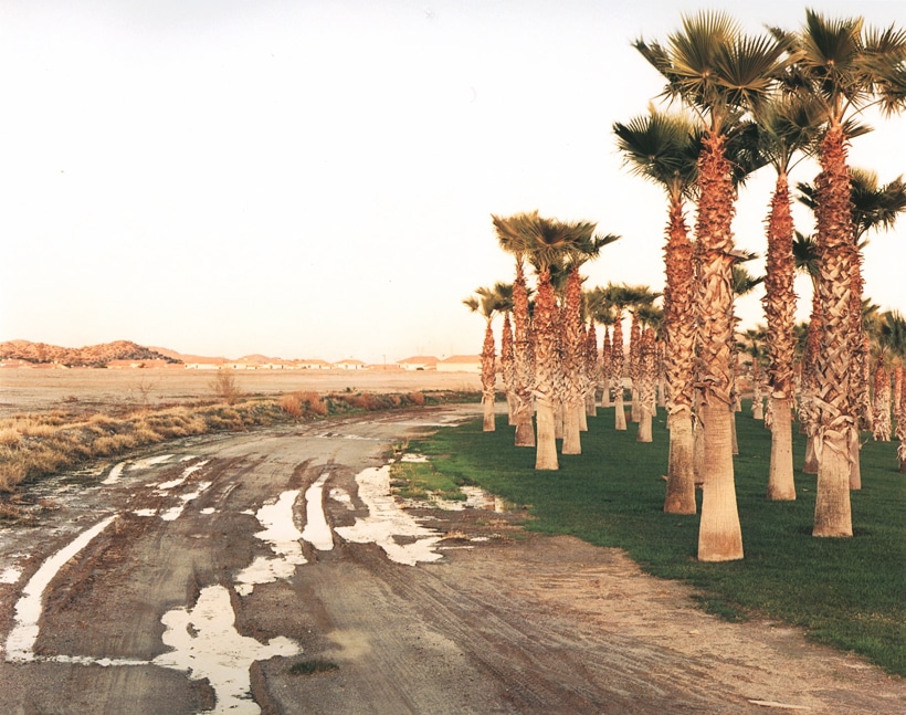
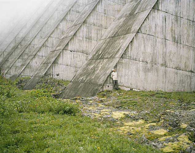
I came across Celina Clanet’s work in Jesse Alexander’s book Perspectives on Place. This project looks at dams in the French Alps, and men connected with them. This intimate connection between place and self drew my attention, as has Clanet’s beautiful images, with their clear, warm palette and careful composition that rarely strays far from the picturesque and the sublime. That’s certainly the case here – the deft use of mist and the receding diagonals of the dam are answered in the line of moss in the lower right hand side, while the figure’s gaze up draws out gaze up too – to take in the vastness of concrete out of frame but presumably above.
It’s this inclusion of people within the landscape, and the way they’re included, that disrupts her work from being simply attractive. The men are generally, as here, diminutive, and neither large enough to be portraits, nor active enough to be documentary. To an extent, they become symbols of the smallness of the men in comparison to the things they make or manage, and thus the extraordinary power of human ingenuity. This mixture of vulnerability and omnipotence is unsettling, as if mankind has alienated himself in the world he makes. It’s both celebration and criticism of the foundations of the anthropocene.
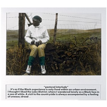
I got talking to an art historian last night who specialises in black women artists of the 1980’s. The historian knows Pollard very well, and it’s a name I’ve come across a few times and meant to check out – as her landscape photography is highly political and very subjective. This is from her book Pastoral interlude, from 1988.
The photo has an extraordinary depth and a great many layers of meaning. The photographic process – hand tinting – takes the viewer first back to the nostalgia of hand tinted postcards, but then, when weighed against the subject of a black woman, one encounters the prejudices and exploitation of the British Empire. Nostalgia is challenged just as the present, with its prejudices and exploitations, is contextualised by an ever-present past.
Pollard’s pose likewise unsettles. Sitting on a dry stone wall, knees bent inwards, her posture, and her clothes, are identical to any female rambler. However, her very dark skin contrasts with the white coat, her headscarf bulges as if hiding dreadlocks, and again the familiar is unsettled, something that is echoed in the text: we feel Pollard’s unease.
As elsewhere in the book, Pollard is excluded from the landscape – here explicitly by the wall and the barbed wire, but also implicitly, hemmed in by the framing fence posts. In fact, the vista occupies only a fraction of the photo, and appears flat, an almost abstract stripe of largely uniform texture.
But Pollard is victorious. The camera in her lap is an expression of agency and power. Her partial profile accentuates her strong facial features and, like the camera, the force of her gaze – though both are directed far away from the recording lens. Moreover, Pollard’s skin tone is precisely echoed in the dry stone wall, perhaps the most archetypal symbol of the Lake District. While Pollard remains separate from the landscape, she is one with the power structures which define it.
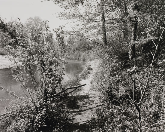
John Gossage has been one of my big discoveries during this course, recommended by one of the staff at the Martin Parr Foundation. His book The Pond appealed to me initially as it’s an intensive, evocative examination of a place that includes many elements also of interest to me – borders, misuse, traces. But what Gossage has really opened my eyes to is the possibility of texture – and specifically messiness, scruffiness.
I’ve long been drawn to line over texture – as in my motorway bridges work, tree shadows, pylons, field patterns, and of course urban environments. But nature is messy, and that mess thwarts clean lines. Gossage embraces that mess – to an extent, so does Baltz – and yet elegant use of line emerges in a symbiotic relationship. This picture is an excellent example. The right third of the frame is a mess of leaves, and the left hand river bank, which would have given the right hand back’s curve emphasis, is hidden behind a small, scruffy tree. This undermines what could have been a picturesque river curve, but it also echoes the scruffy path running alongside it. The Pond demonstrates an unofficial, uncurated natural environment, its human paths more like animal tracks, as if somehow such an environment, with its litter and forgotten barbed wire, is closer to ‘nature’ than the carefully framed and composed places of more conventional landscape photography. Such unfussy human intrusion is present here in the sawn-off branch, an act of violence perhaps, that acts as counterpoint and subversion of the upright trees to the right of the photo and the very young tree in the foreground, the image’s only clean lines.
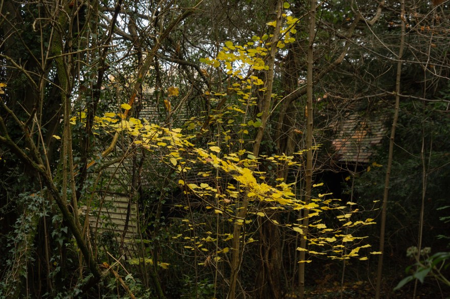
I’ve embraced mess and found form in texture since encountering Gossage. It’s been a revelation, and has also helped me rethink colour. As my commons project will include the messy landscapes of heath and birch woodland, this is just as well.
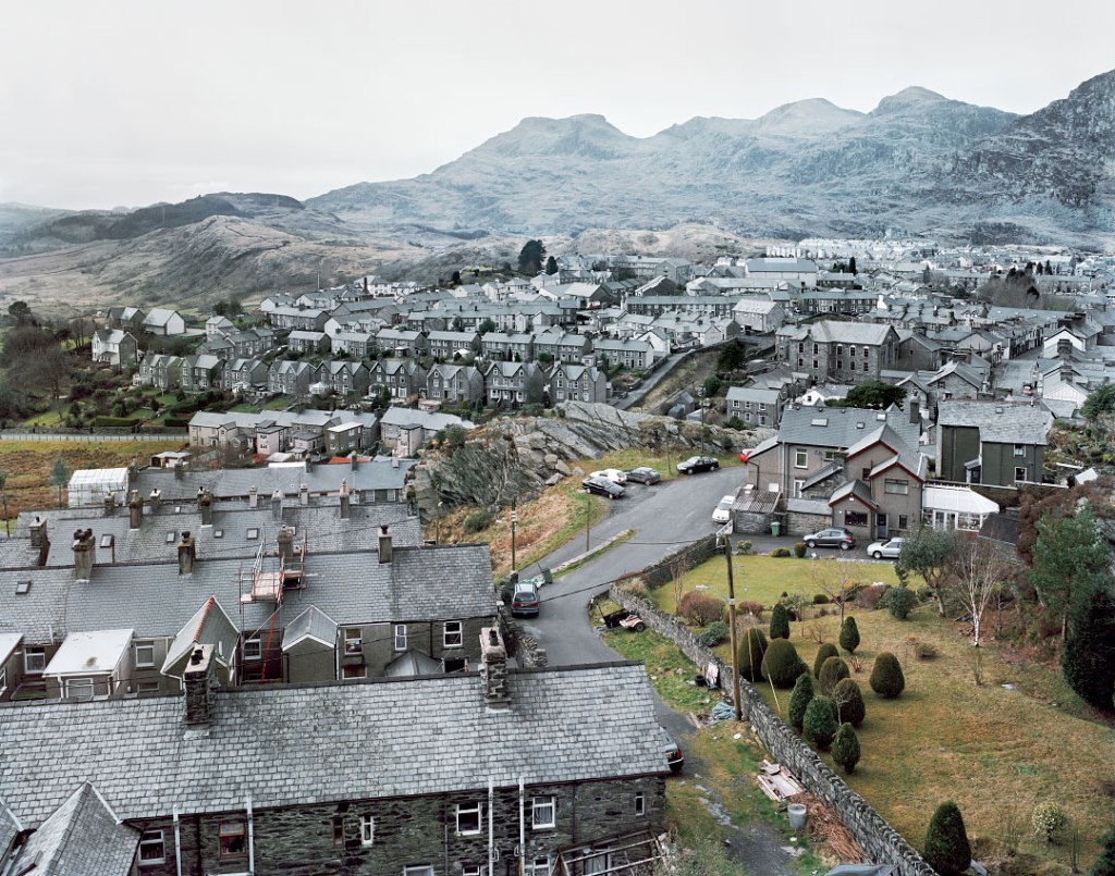
A trip to my home town, which has a wooded common at its heart. The flat light was wonderful for bringing up the textures and colours. I’d anticipated exploring both Tunbridge Wells and Rusthall Commons, but only managed half of Tunbridge Wells’ – there was far more to find than I ever imagined.


You must be logged in to post a comment.